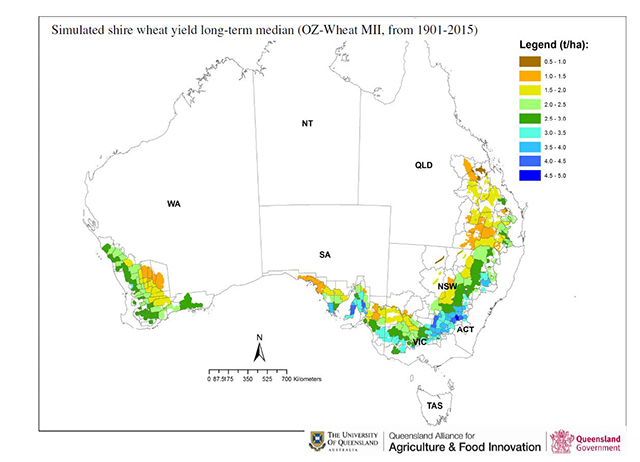
Map 1:
The long-term shire median wheat yield for main wheat producing shires for Australia. Green to brown colours indicate increments of lower median yields, while cyan to dark blue colours indicate increments of higher median yield.
Map 2:
The percentage deviation of the predicted shire wheat yield median from the long-term median (Map 1). Grey shaded colours indicate forecast yields similar to the long-term median. Yellow to red shaded areas indicate the forecast shire wheat yields to be below to very much below the long-term median, while green to blue shaded areas are having forecast wheat yield above to very much above the long-term median.
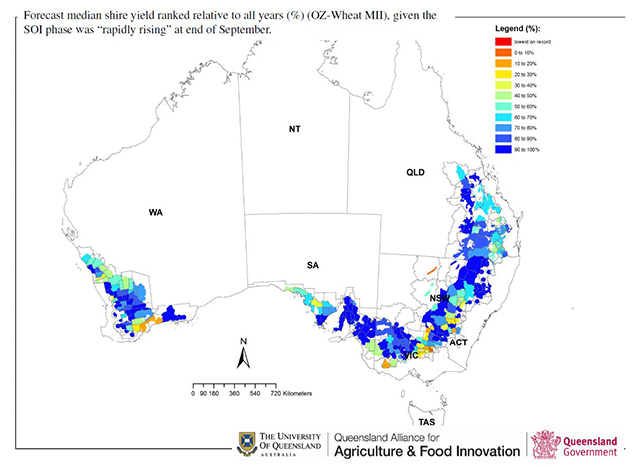
Footnote: Metrics (i.e. Median and percentage deviation) for both maps were derived from a long-term simulated time-series utilising a regional scale biophysical crop model (OZ Wheat MII) for 115 years for each shire.
National Wheat Outlook October 2016
Download PDF 684KB


